A brand with hope
as its common thread
Numerous independent social service organizations—ranging from daycare centers to senior care facilities—operate under the umbrella of the Obervogtländischer Verein für Innere Mission Marienstift e.V. For years, they operated side by side without any branding or visible connection to one another. A merger of the institutions was not the catalyst for the rebranding; rather, it was the other way around.
It was only during joint workshops involving all the institutions that the decision was made to unite under a single, strong brand. From the brand values identified during these workshops, the brand essence crystallized: hope. Since January 1, 2026, the association has proudly embodied this essence in the form of its new, shared name: Hoffnungswerk.
The task
The association’s numerous facilities work across six areas: older people, people with disabilities, education and school, childcare, conferences and accommodation, and services. The name Marienstift referred to a single residential facility and no longer reflected the full range of services. The goal was a shared brand that connects all facilities and keeps the association’s Christian core visible.
The concept
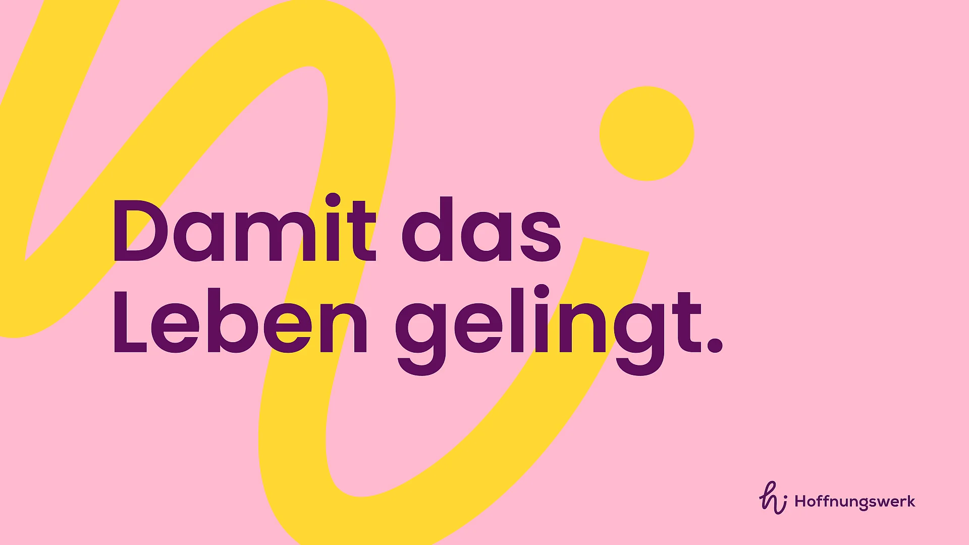
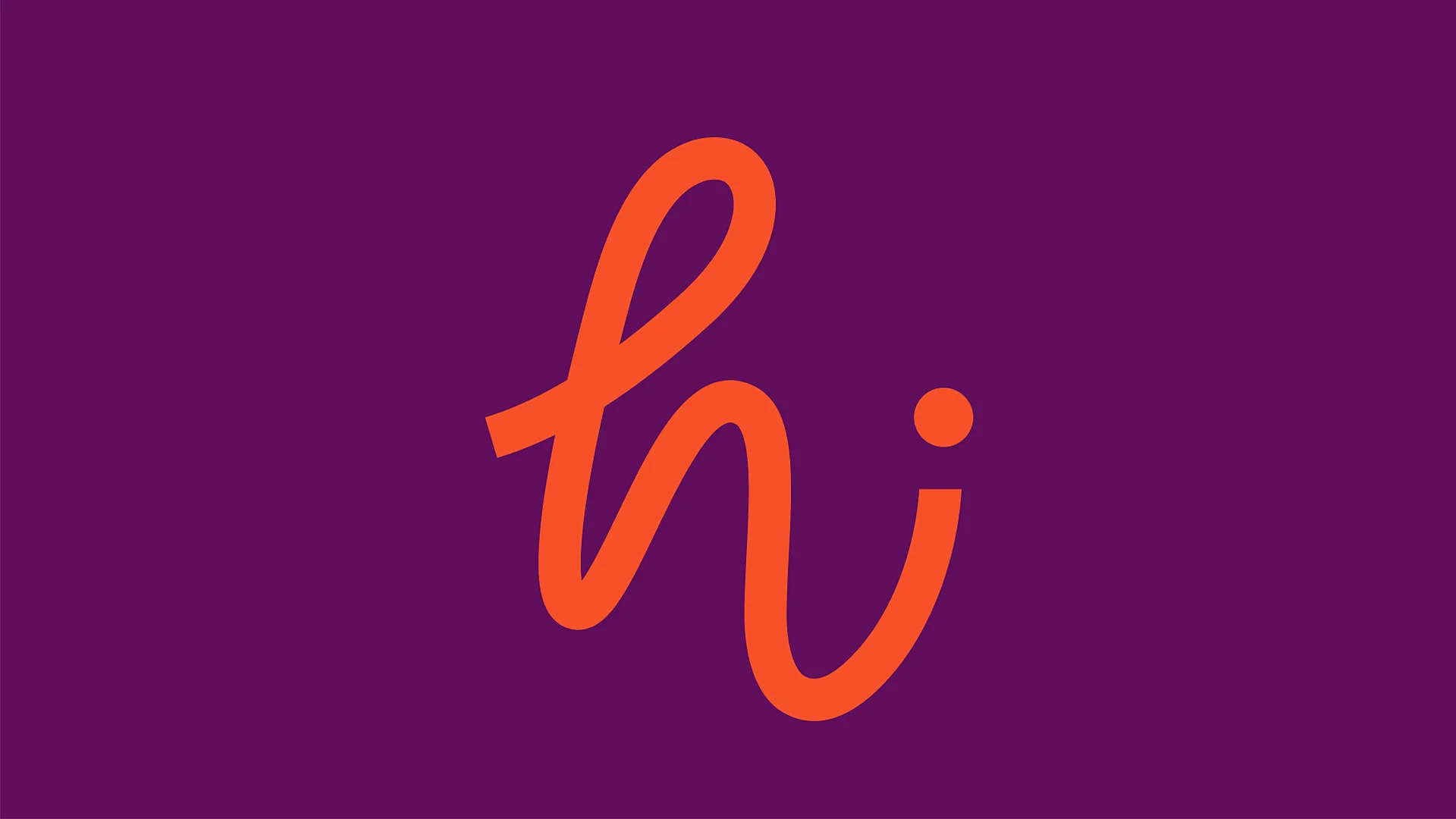
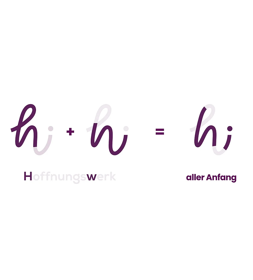
In workshops with all facilities, we worked out the shared values: God-centeredness, acceptance, competence and devotion. From these emerged the brand essence of hope and the new name Hoffnungswerk. The logo combines “h” and “w” into a flowing “hi”, a friendly greeting that makes the first step easier. The claim “Damit das Leben gelingt.” (“So that life can flourish.”) sums up what all facilities stand for together.
The solution
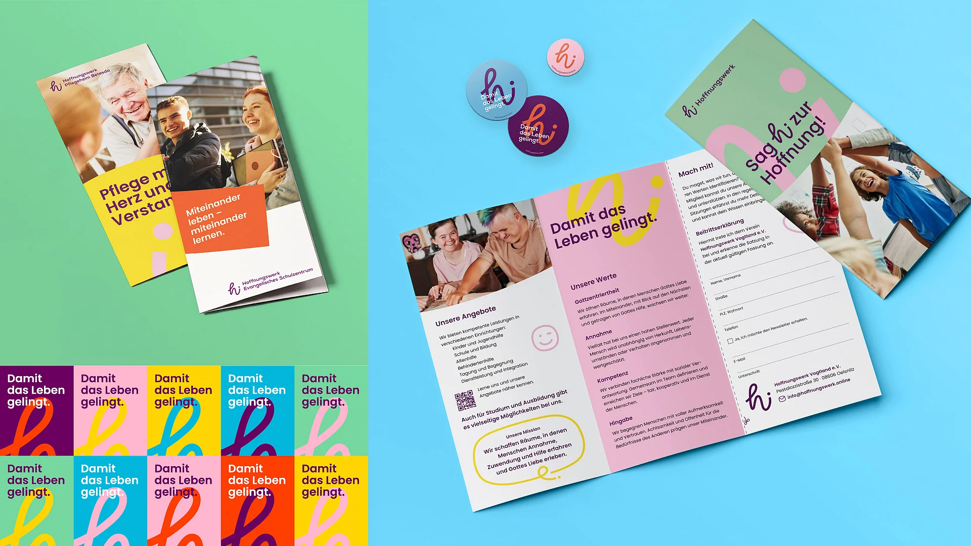
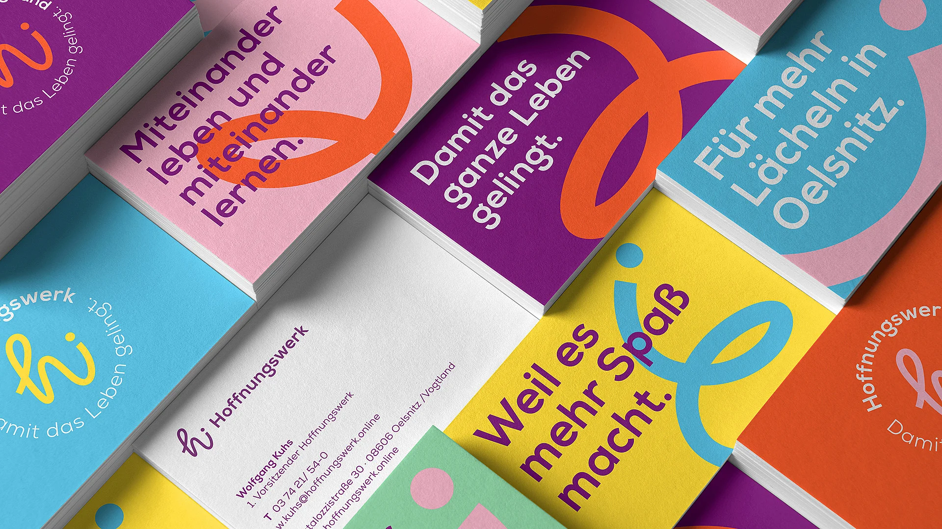
A corporate design with strong colors, the flowing line from the logo and a dedicated icon set. The claim can be adapted for individual facilities and places, for example “Miteinander leben und miteinander lernen.” (“Living together and learning together.”) or “Für mehr Lächeln in Oelsnitz.” (“For more smiles in Oelsnitz.”). Templates for flyers, posters and postcards ensure that all facilities present themselves consistently, and a brand manual sets out the rules. The membership campaign picks up the greeting from the logo: “Sag hi zur Hoffnung!” (“Say hi to hope!”). Developed in 2025, in use since January 1, 2026.
A New Logo
That Says “Hello”
The newly designed logo combines several qualities: The brand’s signature fluid lines—which symbolize change and new paths—merge to form an “h” and a “w,” representing the brand name. A final dot on the “i” forms the greeting “hi”—a symbol of the first, often hardest step of reaching out to someone. At the same time, it warmly conveys that Hoffnungswerk is always there for you and ready to help.
The new brand claim “Damit das Leben gelingt.” (“So that life can flourish.”) serves as both an incentive and a promise of what a simple “hi” can grow into.