Brand Development
A New Look for a Spiritual Beach Resort
Participation as a Form of Expression
Mission
In addition to the beach and apartments, Pinéa offers numerous Christian community programs that guests can participate in – for children, teens, and adults. The new brand should convey what makes a stay here special, wherever guests encounter it. In a brand workshop with the board and teams, we identified what that is.
Idea
Guests should experience a sense of fulfillment – and at Pinéa, this isn’t achieved by watching from the sidelines, but by getting involved. We’ve made this sense of community the central design decision: A brushstroke shows that people have rolled up their sleeves here, and invites guests to do the same. In this way, every guest’s contribution fits in naturally.
Solution
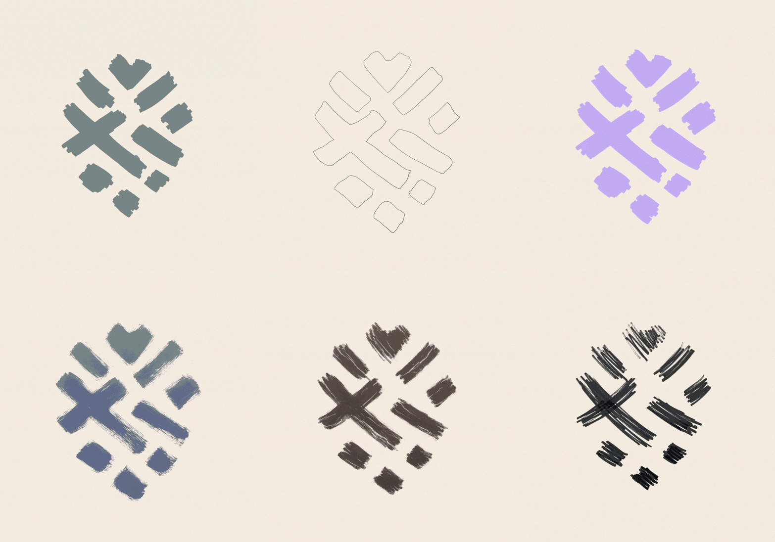
Yellow Tree designed the new logo, a pine cone, hand-painted with individual brushstrokes: at first glance, it resembles Corsica; upon closer inspection, a heart and a cross. The icon set and the custom typeface Pinéa Brush were also created by hand. The logo remains a consistent identifier, but the pinecone is open-ended: children paint their own versions, and their artwork is exhibited on-site. And for what guests find here, we’ve developed a tagline: More than you believe.
More than just a logo
Room for your own
interpretation
Hand-painted by guests and children, designed as a versatile logo.
At first glance, the newly created logo depicts a pine cone, a symbol of Corsica. Look closer and discover a heart and a cross, and with them, the deeper meaning. Just as every guest decides for themselves what this means to them, the logo can also be interpreted in a very personal way. Starting with coloring pages for children, displayed on-site to celebrate diversity, the brand gives all guests the space to discover Pinéa for themselves.
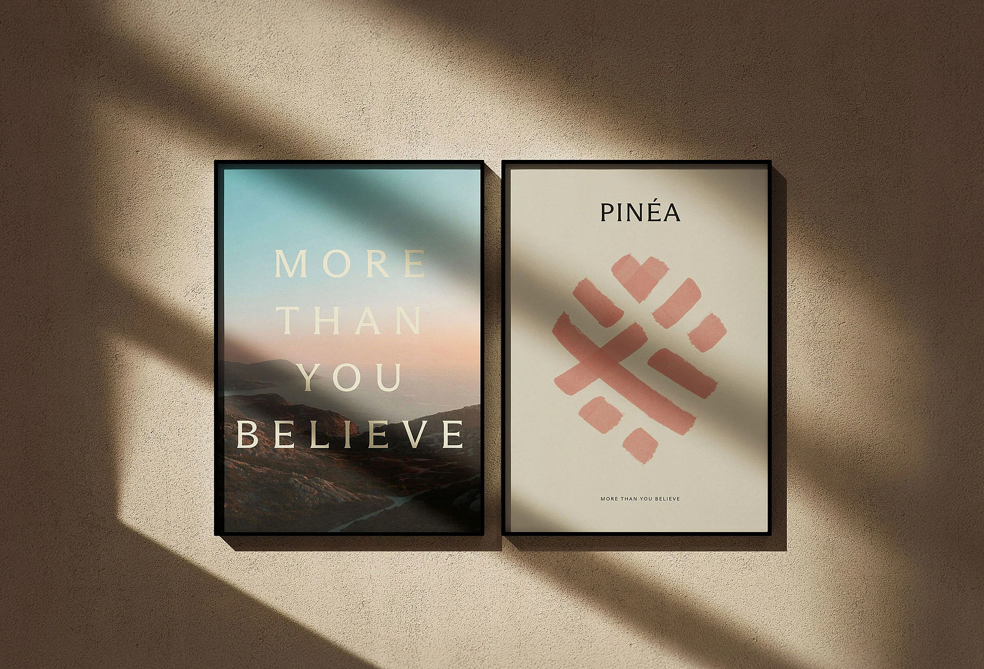
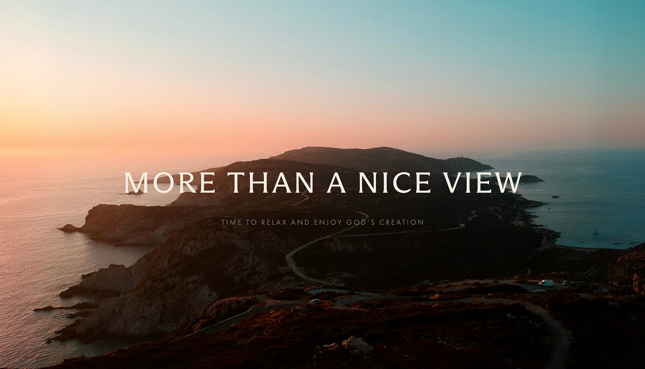
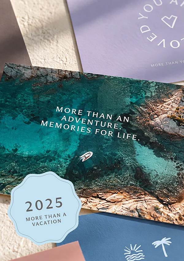
Five o’clock in the morning on the local mountain: Anyone standing here sees more than just a beautiful view, according to Christian understanding, it’s a part of creation. We wanted to bring this deeper perspective into the resort’s everyday life. To do so, we developed an open system of phrasing based on the tagline, one that constantly opens up a new perspective.
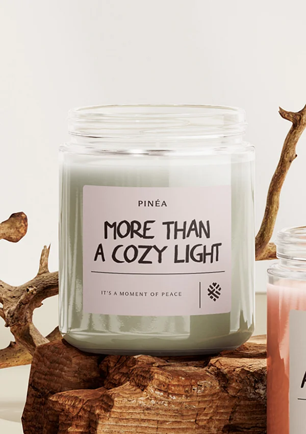
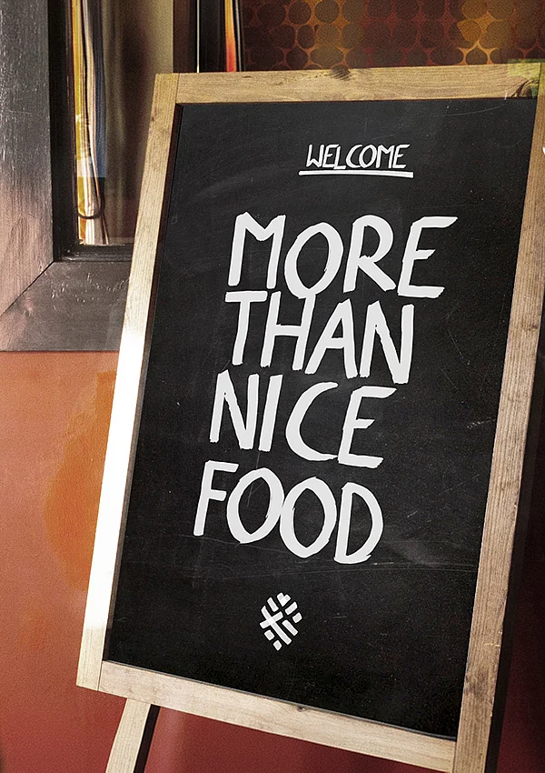
There’s more to everything, even a candle: With the phrase “More than a cozy light,” you might realize that the team placed it there just to make you feel at home. Small reminders featuring “More than …” adorn every aspect of the brand, turning every interaction into an invitation to look deeper and discover more meaning and love, even in everyday things.
Icons & Illustrations
One style for everything
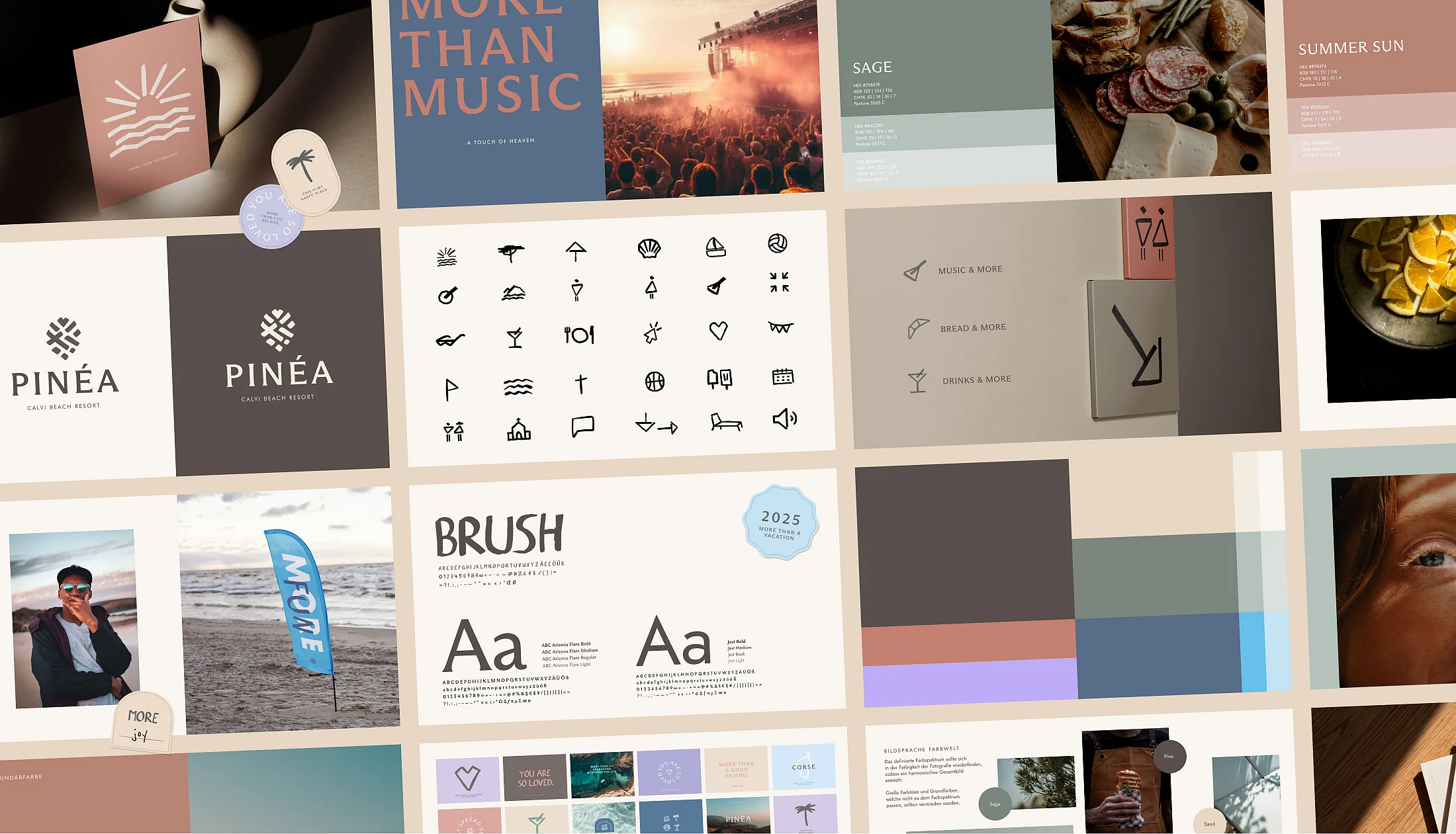
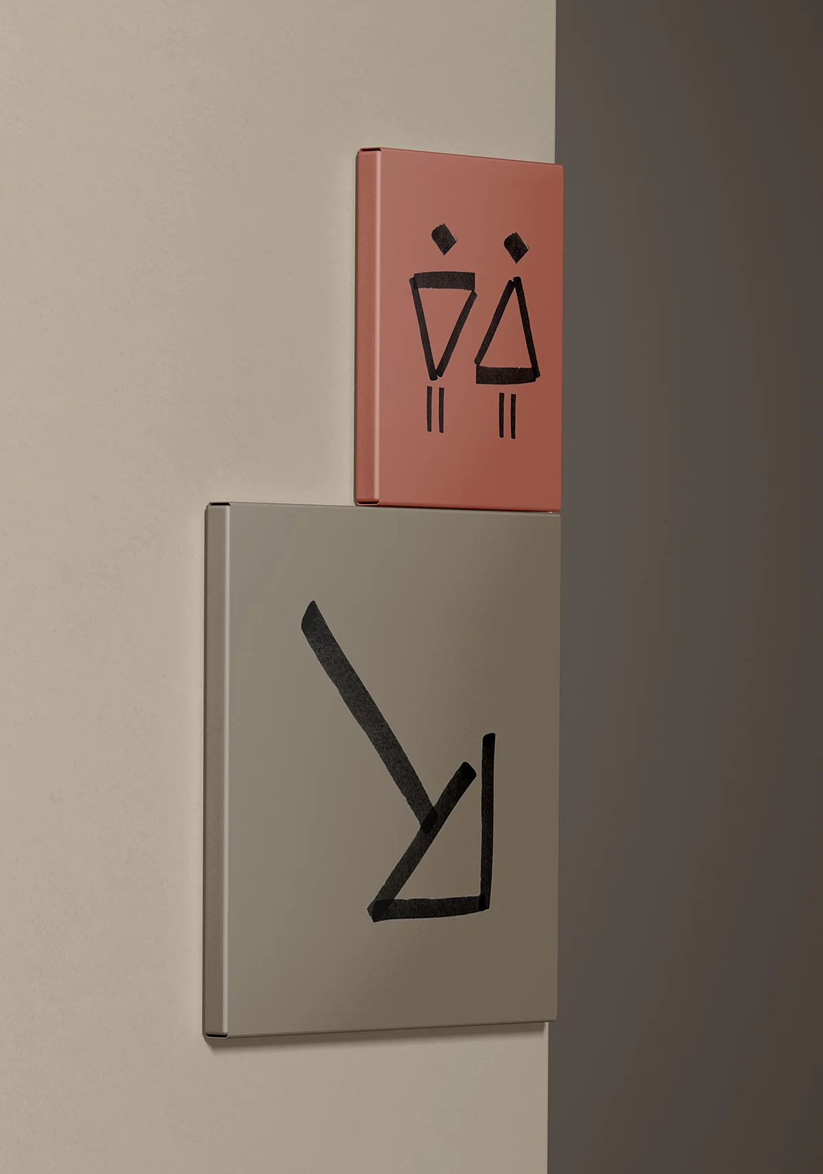
Custom icons, brush font, and illustration style, handcrafted with brushes and paint. The unified drawing style ties everything together into a consistent brand identity.
Designed for every scale: These lovingly crafted icons are used as small UI elements on the website, across a wide variety of media, and even in the on-site wayfinding system in Corsica. Guests will recognize the same brushstrokes on the beach sign that they saw back home when booking, in the floor plan of their apartment. A unified experience, thoughtfully designed throughout the entire user journey.