Social change can only be achieved through collective effort
New Brand Identity for Germany's Largest Foundation
Real change does not happen in isolation, but through collaboration—the Robert Bosch Foundation is convinced of this. As Germany’s largest foundation and one of the largest in Europe, it invests in socially oriented projects for the future, with a focus on health, education, democracy, and international understanding. Under its new slogan, “Together We Make a Difference,” the foundation is now bringing to light what it has long embodied: partnership.
Assignment
Ten years after its last major relaunch, the Robert Bosch Foundation has repositioned itself—for the first time in collaboration with the Robert Bosch Academy, which is undergoing its first rebranding since its founding twelve years ago and is now visually aligning more closely with the Foundation. With the goal of conveying the Foundation’s culture in a more visible and authentic way, Yellow Tree was commissioned to handle the branding work.
Idea
Highlighting what matters: The major challenges of our time cannot be overcome alone. To enable real change, the foundation focuses first and foremost on bringing together experiences, reach, knowledge, and people. It is precisely this momentum of bringing people together that we have made the central element of our brand: You & Us.
Solution
Yellow Tree developed the complete brand identity from a single vision in close collaboration with the foundation—from the fundamental direction, through communication and design principles, to a scalable design system that is used both by the foundation itself—with its approximately 400 collaborating partners worldwide—and by the affiliated Academy, with future potential entities also taken into account.
More Than Just a Logo:
The New Figurative Mark as a Unifying “&” Symbol
Hardly any other symbol worldwide stands as clearly for connection as the “&” symbol. The Robert Bosch Stiftung’s redesigned logo picks up on exactly that: It retains the original text layout and the foundation’s initials within the figurative mark, but allows them to recede visually by merging them into an “&” symbol. Even in how we use the logo, the focus is not on the foundation itself, but on “we”—which is why we use the new, iconic logo as an actual, functional “&” symbol. Like the foundation itself, it connects what meaningfully belongs together: Peace & Democracy. You & Us.
The Heart of the Foundation
Handwriting Inspired by the Founder
Founded in 1964 in accordance with Robert Bosch’s will, the Foundation remains true to its roots and the founder’s philosophy to this day. The new branding features a carefully selected, modernized handwriting style inspired by Robert Bosch’s own. It is a defining element of the new brand identity, which, among other things, stands for warmth, empathy, and humanity.
Three project strands. Two years. One goal.
It sounds big—and it is. But we feel right at home here, too: multi-stage pitch process, participatory processes, workshops, preliminary analyses, employee surveys, brand refinement, tagline development, logo design, illustration kit, UI design, usability lab testing, motion design, templating, asset creation, and our own brand portal.
Designed with love:
Robert Bosch’s Unique World of Illustrations
It called for a world of illustrations that felt just like the foundation itself: human, warm, and honest. Yellow Tree created an organic interpretation of classic paper-cut graphics, incorporating the brand’s signature grain to evoke a handmade feel. Details such as glasses, a wheelchair, Afro hair, or a headscarf convey what defines the foundation: diversity and exchange—from small icons to scenes where people work like a swarm on oversized objects. A symbol of tackling the great challenges of our time together.
Accessible UI Design
with an Editorial Focus
The foundation’s website also does not focus on the foundation itself, but rather on its grants and partners. This was based on a completely reimagined page and navigation structure that, for the first time, presents the scope of topics—which has grown over the years—in a user-friendly way. Building on this, the UI design—from the smallest building block to the entire system—was consistently developed around key publications, news, and editorial content. The resulting prototypes were tested in a dedicated usability lab with a diverse international group of participants, designed to be accessible, and reviewed in consultation with Sozialhelden e.V.
A massive brand. A Brand Portal.
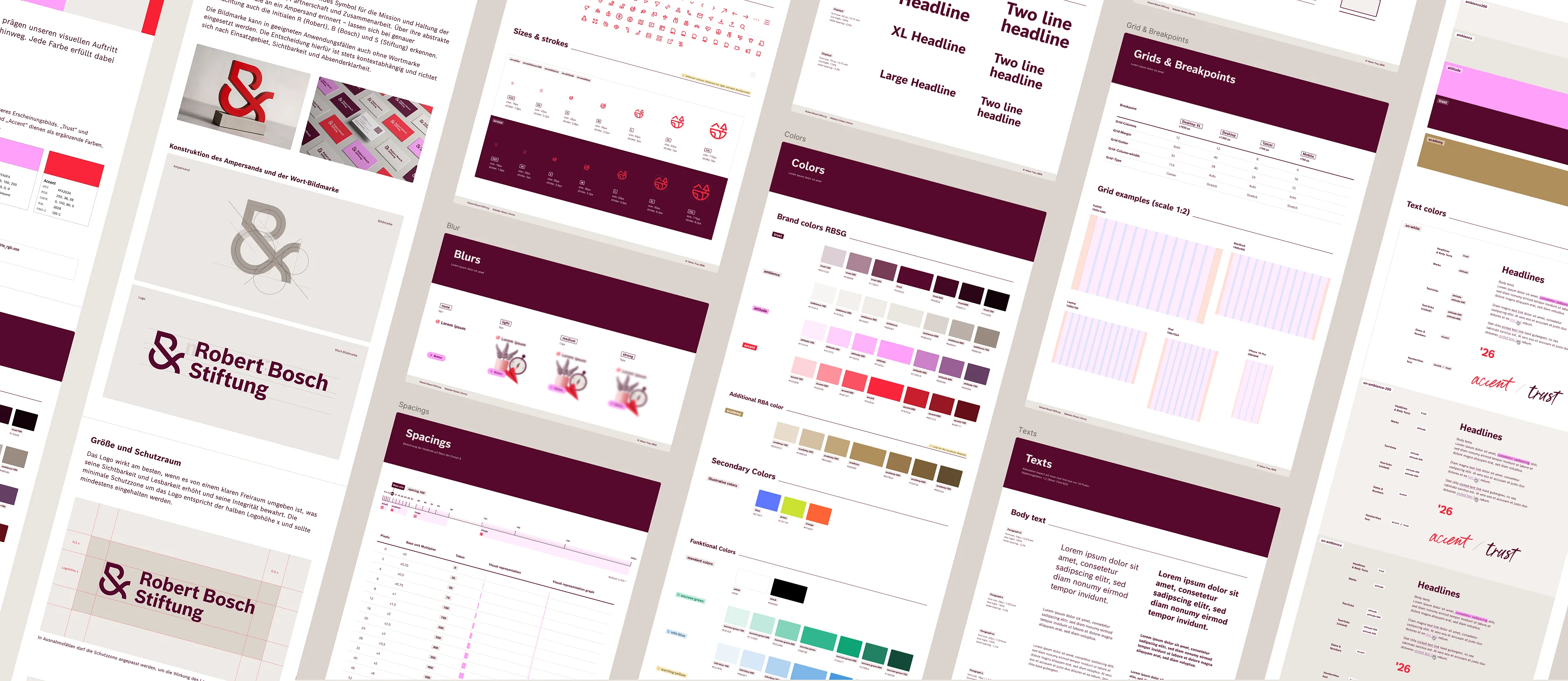
At the heart of the brand implementation is the Brand Portal developed by Yellow Tree based on Frontify—the central hub for everyone who works with the brand, including more than 400 partners worldwide. This is where the brand guidelines for the Foundation and the Academy are consolidated, along with countless assets, templates, and comprehensive media libraries—a massive collection.
Templates
Templates for virtually every touchpoint and use case—whether internal, external, for a foundation, an organization, or a partner. The scope ranges from business stationery, writing materials, and other internal media, to external formats such as flyers, white papers, reports, and annual reports, all the way to event communications such as invitations, banners, lecterns, moderator cards, backdrops, and name tags.
Motion- & UI-Kits
All the necessary materials for digital applications can also be found in the Brand Portal. Yellow Tree not only defined the look and feel for this, but also handled the creation of assets and templates. A comprehensive global UI kit, as well as social media templates and motion design templates, are now available in the portal.
Illustration Kit
The several hundred custom-created illustrations, designed in the defined brand style, are also available as a comprehensive, filterable library in the large Brand Portal. They can be accessed as individual illustrations or as ready-made, combined scenes, depending on your needs, and are available in a wide variety of colors and output formats.
Bild-Libraries
Eine große, nutzerfreundlich filterbare Datenbank bündelt Bilder, Icons und Videos der neuen Marke an einem zentralen Ort. Über 10.000 fertig vorgestylte und eingefärbte Icons, realisiert in Sonderkooperation mit Streamline, stehen direkt im benötigten Format zum Download bereit, ergänzt durch die komplette Bild- und Videodatenbank der Stiftung.